Friday, June 15, 2012

Lab 8: Mapping the Station Fire in ArcGIS

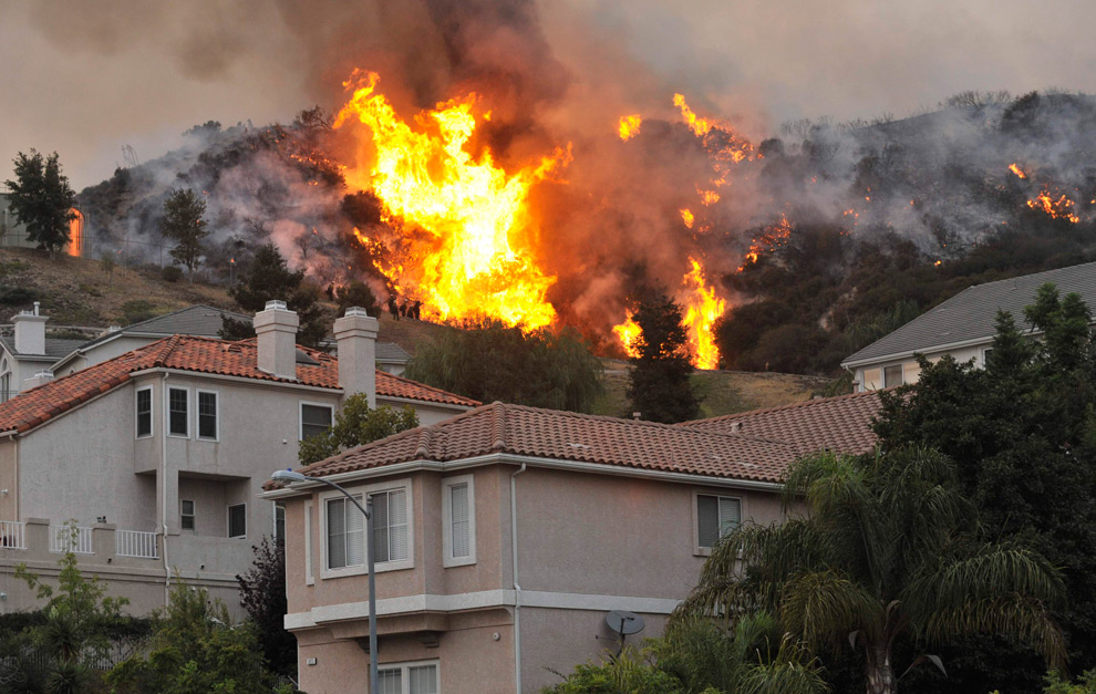
This week looked at Station Fire in ArcGIS. We are looking at the 2009 fire of Los Angeles. By early September this fire has burned over 140,000 acres of land, a lot of which were homes and buildings, and had also taken the lives of two firefighters. Firefighters have been working to keep the fire at bay but this was one of the largest fires that Los Angeles has ever seen (inciweb). 


Image of Station Fire


This reference map of Los Angeles shows the different counties of Los Angeles. The fire burning would be able to be seen from all different areas of Los Angeles and likewise, these areas would be affected by the smoke and debris from the fires. The fire would be able to travel to these surrounding areas fairly easily because of the proximity. The map shows many different freeways and highways that firefighters could have taken to be able to get closer to these fires in order to put them out so they would not have the chance to spread to closer areas. 


This thematic map shows how quickly and intensely the fire was able to grow in size just within a few days. The fire started in one area and August 30th shows a large growth in size as the station fire began spreading to other areas of Los Angeles fairly quickly. Many factors contributed to the fire being able to spread to such great proximity. Weather conditions were very crucial to the fire being able to spread and firefighters did not feel positive about controlling the fire until weather conditions were able to improve but officials say that the fire was so intense that it was creating its own wind patterns (cnn.com.). These extreme factors caused the fire to easily spread into detrimental sizes.

After the fire had subsided, scientists and biologists came in to examine and investigate the damage that the fire did to other aspects such as animal life and soils. Many of the species have been taken into further investigation as well as to be cared for until they can be rereleased into the wild once the environment is safe enough (Archibold). Many different species were also taken in more autopsies to see the affect of the fire on these now dead animals. The aftermath of the fire showed many dead forest trees and there was an effort to try to replant the trees (Sahagun). Reforestation is a costly thing but it is an ecological measure that needs to be taken to somewhat cushion the destruction caused by this fire. The animals and the agriculture has been deeply scarred by this wildfire. 

After further investigation, it was found that this fire was possibly started purposely by arson (Batty). Since this fire was started  unnaturally by human action, this coupled with the environmental conflicts, this fire was able to spread to large areas in the Los Angeles area. A fire of this size was able to cause a lot of destruction to many homes and lives of people living within proximity of the fire. Firefighters were not able to find anything that may have caused the fire such as a faulty powerline or lightning (Batty). Luckily firefighters were able to extinguish the fire, but not until it was able to claim the lives of many as well as destroying homes and buildings of the surrounding areas of Los Angeles.


"'Angry Fire' Roars across 100,000 California Acres." CNN. CNN, 31 Aug. 2009. Web. 10 June 2012. <http://articles.cnn.com/2009-08-31/us/california.wildfires_1_mike-dietrich-firefighters-safety-incident-commander?_s=PM:US>.

Archibold, Randal C. "After a Devastating Fire, an Intense Study of Its Effects." The New York Times. 3 Oct. 2009. Web. 10 June 2012.

Batty, David. "Los Angeles Wildfire Was Arson, Say Police." The Guardian. Guardian News and Media, 09 Apr. 2009. Web. 10 June 2012. <http://www.guardian.co.uk/world/2009/sep/04/los-angeles-wildfire-arson>.

Sahagun, Louis. "3 Million Trees to Be Planted in Station Fire Burn Area." Los Angeles Times. Los Angeles Times, 15 Apr. 2011. Web. 10 June 2012. <http://articles.latimes.com/2011/apr/15/local/la-me-station-fire-20110415>.

"Station Fire Evening Update Aug. 31, 2009." (2009): n. pag. Web. 10 Jun 2012. <http://inciweb.org/incident/article/9360/>.


Thursday, June 14, 2012

Lab 7: Census 2000/2010


This map makes it clear that a large percent of the Black population in the United States in located in the Southeast in states such as Georgia, Alabama, Mississippi, and Louisiana. The legend shows that the darker in color an area is, the higher the population of the Black community there is living there. This is probably due to historical events that took place that created a Black diaspora in those areas. From looking at the map, it is clear that as Blacks continue living in these areas, there is a spread to other surrounding states as they continue to move to other neighboring states.


Compared to the first map, the Asian population isn't as heavily dense in particular areas. There is some density on the west coast in California, Washington and Oregon as well as some spread around the east coast. This may be because the proximity of Asia to North America on the west coast. From immigrating to the United States, the states on the west coast are closer to Asia and are therefore more likely to be a home for many Asian populations.


The "other" population would include such races as Europeans, South Americans, Latin America, and many others. These populations are seen densely populated on the southern border such as Texas and Arizona. From observing this map it is assumed that Hispanics are categorized as other and these populations are heavily spread in Southern United States closer to the Mexico border.

These census are a way to see where certain populations of people live. From there, it can be further investigated as to why these races live in these certain parts of the United States as well as other parts of the world. It would be better to be able to break up these populations such as the Asian population as many different cultures make up "Asia" and many of them are even more dispersed based on which part of Asia they are from. This can also be done of the other category in order to get a better understanding of where people live.


Monday, May 21, 2012

Lab 6: Digital Elevation Models in GIS


                The area that I have chosen for my digital elevation model is located around the Lower Pitt-Taylor Reservoir in Nevada. The frame that was used has the coordinates: 39.8452 for the top edge, 39.4416 for the bottom, -118.3163 for the left, and -117.74083 for the right edge. This map was created referencing the North American Datum of 1983. The DEM shows the elevation of the mountainous terrain as well as the slope and aspect of the terrain. The aspect shows the steepness of the given surface area. The lab also shows a 3D model of the terrain which helps visualize the terrain instead of seeing it on a flat 2-D surface.
                Being able to see the different gradients of the DEM made it easier to see the elevation for the terrain as well as the slope surface of it. By exploring the different features of the program, I was able to learn about the surface of the area I chose.

Friday, May 18, 2012

Lab 5: Projections in ArcGIS


Using projections is an efficient way to visualize the earth. Since the earth is a sphere, it is difficult to observe it unless it is projected in a way that lets us see it as a plane. Thus, we must distort the earth in different shapes and sizes which ultimately distorts its true distances and areas. The true shape of the earth as well as its continents are not going to be retained and thus, they will be skewed in different way. The different types of projections that we observe in this lab are: Conformal, Equal Area and Equidistant.
Conformal maps keep the latitude and longitude lines at angles instead of curving them as seen in the first two map projections. Area and distance are not retained in these map projections however. As seen in the Mercator map, areas further from the equator are stretched and are more distorted due to its cylindrical projection. It is best used for projection.
Equal area map projections are able to preserve the actual area of land on these projections. For both the sinusoidal and the Bonne map projection, the areas of the continents are equal in size to their actual land mass. However, the areas away from the central point are much more distorted such as in the Bonne map projection, Africa seems to be the least distorted as it in the center focus of the map projection.
Equidistant map projections preserve distance. It portrays the distance from the center of the map to other place on the map. These maps are used for radio and seismic mapping. The equidistant cylindrical map projection have equally spaced longitudes and latitude lines.
Map projections should be selected based on what you are observing on the map projections. Different map projections are more catered to specific purposes such as certain continents are different navigational purposes. There are some projections that are created to observe certain areas and distances. Such as observing the distance from two cities, different map projections will show a different area where some are more accurate than others.

Friday, May 11, 2012

Lab 4 - Introducing ArcMap

By using GIS features, we are able to explore the different layers of a proposed map based on particular interests. In this particular lab assignment, we are able to view the different maps of a proposed airport expansion based on the Land Use, Schools, and Population Density of the same area within the same map layout. This allows up to simultaneously explore different aspects of an area without the congestion of information on a single map by being able to hide and show layers with ease.
This system is beneficial in allowing different methods and possibilities in map construction with ArcGIS. The fact that it is computer generated allows precision and accuracy in viewing these maps without too much interference of human error. With the available data and accessibility of the programs, anyone is able to create maps of whatever they need in order to fit their specific needs. Any calculations and measurements are handled with the operating systems that makes it easier to create these digital maps.
The downfall is the difficulty in creating these maps with ArcGIS. There are many different components and functions to do and learn that it becomes complicating if one is not familiar with the program. In creating these maps with ArcGIS, I ran into difficulties by clicking incorrect buttons or not understanding the terminology. The data must also be organized so that the software can understand the data you are inputting into the system.
Though it is difficult, this program is beneficial to learn because creating these types of maps can help in all sorts of research. With this program, we are able to learn about different areas and all the sorts of features that it possesses. Moreover, we are able to present the data in a graphic form to inform other of the findings.


Thursday, April 26, 2012

Lab 3 - Neogeography


View Geog 7 - The Big Bang Theory in a larger map


Neogeography or "new geography" is the idea of using and creating maps for personal use or for a community use. They are made by people that are not considered "professionals" and are more informal. Neogeography has an ease to its use and is useful for sharing information for a personal use such as with friends and family. It makes it easier for people to gain access to map information. Also, this technology is beneficial because it allows people to share directions to each other with more clarity than written down street signs. People are provided the tools they need to create any map as they please. 


The downside of neogeography is the unreliability of the information. Because it is created by "unprofessionals" and generally people who are not credited to make maps, the information that a map provides may not be exact. The information may also be skewed towards the map maker's interest. Point in being is the map that I have personally created for this lab. Neogeography allows us to map out these different locations for our own personal purposes and does not follow a strict or uniform rule about what can and cannot be mapped out. 


This map in particular is an example of neography made through the google maps feature. It maps out a few of the popular locations that are seen in the television show, "The Big Bang Theory." This map, though fairly based off fiction, is purposeful to the community that has an interest in the television show and are interested in experiencing the lives of these fictional characters. Though this map is a positive example of neogeography in that anything can be mapped out based on the user's desires without much limitations, the downside is the credibility of the maps that are created. The credibility of the map should not turn people away from neogeography though because the benefits of it are still much greater. 

Friday, April 20, 2012

Lab 2 - USGS Topographic Maps

1. What is the name of the quadrangle?
Beverly Hills Quadrangle

2.  What are the names of the adjacent quadrangles?
Canoga Park Quadrangle, Van Nuys Quadrangle, Burbank Quadrangle, Topanga Quadrangle, Hollywood Quadrangle, Venice Quadrangle, and Inglewood Quadrangle

3. When was the quadrangle first created?
This quadrangle was first created in 1966

4. What datum was used to create your map?
The National Geodetic Vertical Datum of 1929

5. What is the scale of the map?
1:24,000

6. At the above scale: answer the following:

a) 5 centimeters on the map is equivalent to how many meters on the ground? 1200 meters
b) 5 inches on the map is equivalent to how many miles on the ground? 1.89 miles
c) 1 mile on the ground is equivalent to how many inches on the map? 2.64 inches
d) 3 kilometers on the ground is equivalent to how many centimeters on the map? 12.5 centimeters

7. What is the contour interval on your map?
The contour interval is 20 feet.

8. What are the approximate geographic coordinates in both degrees/minutes/seconds and decimal degree of

a) the Public Affairs Building: 34°4'26" / 118°26'24" & 34.074°N, 118.390°E
b) the tip of Santa Monica Pier: 34°0'25" / 118°29'50" & 34.007°N, 118.499°E
c) the Upper Franklin Canyon Reservoir: 34°7'13" / 118°24'32" & 34.120°N, 118.409°E

9. What is the approximate elevation in both feet and meters of

a) Greystone Mansion: 570ft / 173.73 meters
b) Woodland Cemetery: 140 ft / 42.67 meters
c) Crestwood Hills Park: 720 ft / 219.46 meters

10. What is the UTM zone of the map?
UTM Zone 11

11. What are the UTM coordinates for the lower left corner of your map?
0361500, 3763000

12. How many square meters are contained within each cell of the UTM gridlines?
1 square kilometer 

13. Obtain elevation measurements, from west to east along the UTM northing 3771000, where the eastins of the UTM grid intersect the northing. Create an elevation profile using these measurements in Excel.

14. What is the magnetic declination of the map?
14 degrees clockwise

15. In which direction does water flow in the intermittent stream between the 405 freeway and Stone Canton Reservoir?
Water is flowing south because of the declination of the land.


Friday, April 13, 2012

Lab 1 - Maps

Map #1


This map shows the the access to improved water sources in the world from 2004. From this map you can easily see which areas of the world have access to clean water and which countries need improvements in their water quality. This map is interesting because, from the percentage of improved water sources in certain countries, it can be further investigated why this is the case for that country whether it is within their government to fix these problems or if it is a matter of environmental conflicts. 

Map #2


This map show the states of the USA and the percentage of obese adults within the particular state. What is interesting about this map is that, most people consider America to be obese but in this map, you can see which states in particular are suffering from this health problem. Also from this, you can further investigate the causes for these states with higher percentages of obese adults and what their health regulations are for that state. From investigating this information, it can be used to conclude what are the causes for these differences in percentages. 

Map #3


This map depicts the amount of crimes within a state per 100,000 residents in 2004. From what it seems, California has an alarmingly high amount of crime rates in comparison to other state but it should also be considered that California is also home to much more residents than other states. In this way, maps can also be misleading if the information that you are seeking is not carefully researched. Despite any misconceptions that may come from the information provided, this map is interesting because it shows how much more crime is being committed in other states within America and it can also be researched as to why these states are seeing more crimes than others.